WisDOT Crash Comparison Dashboard
Shiny
Data Viz
API
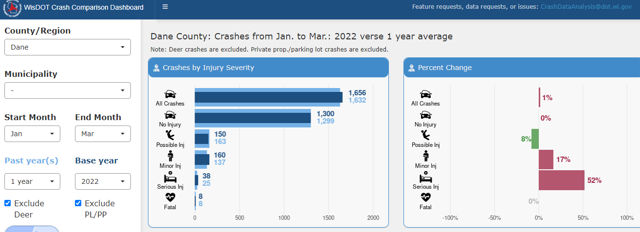
This is a Shiny dashboard that compares crashes by quarter within a selected County or Municipality. This analysis was previously done manually in Excel, needing to find the number of crashes for each crash flag/type for each quarter. This dashboard fully displays all this info via a series of bar charts. One can see both absolute change and the percent change in the number of crashes.
What I learned
Knowing this dashboard would be viewed on a variety of screen sizes, I used dynamic font sizes (i.e. 1.2em) as opposed to static font sizes (i.e. 12pt). I also wrote CSS as to make printing of the entire dashboard possible on two pages.
Highlighted packages
The dashboard uses dashboardthemes, ggplot2 and ggtext using the golem framework.